Android pause features show that digital wellbeing is still an unfinished idea. Phone makers know people want help managing distraction, but the tools often remain too hidden, too strict, or too easy to ignore. A feature that pauses an app, adds a brief delay, or nudges someone before opening a time sink can be useful. The problem is making that control simple enough to use on an ordinary Tuesday, not just during a weekend productivity reset.
Hidden controls rarely change habits
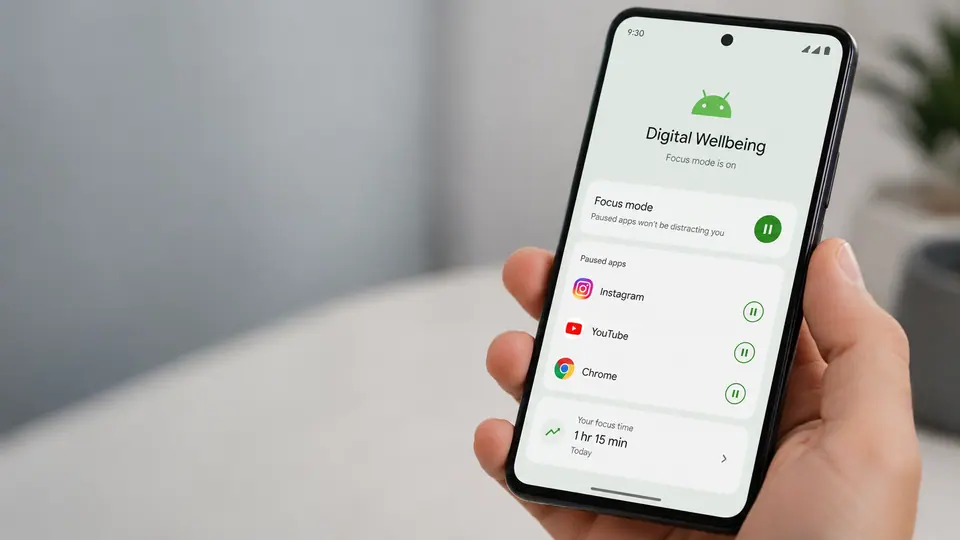
Many digital wellbeing tools suffer from being buried in settings. A person may discover them once, set a limit, and then forget where the controls live. Others never find them at all. That is a mismatch with the problem. Distraction happens in the moment, when someone taps an app almost automatically. If the tool lives far away from that moment, it becomes more like a report card than a steering wheel.
The more promising approach is lightweight friction. Instead of permanently blocking an app, the phone can ask whether the user really wants to open it right now. Instead of making limits feel punitive, it can offer a temporary pause that fits a meeting, dinner, bedtime, study session, or commute. Strict blocking can help some people, especially when they choose it deliberately. But for many users, a small interruption is enough to break the reflex without creating a fight against the device.
The best tools fit routines
Digital wellbeing works best when it adapts to normal life. A parent may want social apps paused during school pickup. A student may want video apps quiet during class hours. A worker may want shopping apps hidden during focus time but available later. A person winding down at night may need fewer alerts, dimmer visuals, and less temptation to scroll. These are practical routines, not moral judgments about phone use.
That matters because shame is a poor product strategy. If a phone makes users feel bad, they may turn the feature off. If it helps them follow their own intentions, they are more likely to keep it. The language should be calm and specific: pause this app for one hour, hide notifications until morning, ask before opening, or allow only important contacts. A digital wellbeing control should feel like adjusting brightness, not confessing failure.
Attention tools need trust
There is also a trust issue. Phones already know a lot about when and how apps are used. If attention features become more proactive, users will want to understand what is being measured and whether that information stays on the device. A suggestion to pause an app can feel helpful if it is transparent. It can feel creepy if it seems to judge behavior without explanation.
App developers are part of the story too. Many apps are designed to pull people back with streaks, alerts, badges, recommendations, and endless feeds. Operating system controls are trying to manage incentives that apps themselves often create. That does not mean the effort is hopeless, but it explains why digital wellbeing can feel incomplete. The phone is both the source of the distraction and the tool that promises to manage it.
The next step is not necessarily harsher limits. It is better placement, clearer choices, and more humane defaults. Pause features should be available from the launcher, notification, recent apps view, and app info screen. They should be easy to start and easy to adjust. They should make room for exceptions without turning into a complicated rules engine.
Digital wellbeing will remain unfinished because attention is personal and context changes constantly. But Android pause features point toward a better model: less grand self-control theater, more practical interruption at the point of habit. A phone cannot decide what matters for its owner. It can, however, make the next tap a little less automatic.