Introduction
Exploratory Data Analysis (EDA) is a critical step before performing deeper data analysis or developing AI systems based on machine learning models. While addressing common data quality issues is often handled in later stages of the data pipeline, EDA offers an excellent opportunity to identify these problems early. This proactive approach helps prevent biased results, degraded model performance, or compromised decision-making.
This article presents seven Python techniques useful in early EDA processes for effectively detecting and resolving various data quality issues.
To demonstrate these techniques, a synthetically generated employee dataset will be used. This dataset intentionally includes various data quality issues to illustrate their detection and handling. Before trying these tricks, ensure the following preamble code is copied into your coding environment:
import numpy as np
import pandas as pd
import matplotlib.pyplot as plt
import seaborn as sns

# PREAMBLE CODE THAT RANDOMLY CREATES A DATASET AND INTRODUCES QUALITY ISSUES IN IT
np.random.seed(42)

n = 1000

df = pd.DataFrame({
    "age": np.random.normal(40, 12, n).round(),
    "income": np.random.normal(60000, 15000, n),
    "experience_years": np.random.normal(10, 5, n),
    "department": np.random.choice(
        ["Sales", "Engineering", "HR", "sales", "Eng", "HR "], n
    ),
    "performance_score": np.random.normal(3, 0.7, n)
})

# Randomly injecting data issues to the dataset

# 1. Missing values
df.loc[np.random.choice(n, 80, replace=False), "income"] = np.nan
df.loc[np.random.choice(n, 50, replace=False), "department"] = np.nan

# 2. Outliers
df.loc[np.random.choice(n, 10), "income"] *= 5
df.loc[np.random.choice(n, 10), "age"] = -5

# 3. Invalid values
df.loc[np.random.choice(n, 15), "performance_score"] = 7

# 4. Skewness
df["bonus"] = np.random.exponential(2000, n)

# 5. Highly correlated features
df["income_copy"] = df["income"] * 1.02

# 6. Duplicated entries
df = pd.concat([df, df.iloc[:20]], ignore_index=True)

df.head()
1. Detecting Missing Values via Heatmaps
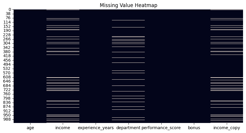
While Python libraries like Pandas provide functions to count missing values per attribute, a visual heatmap offers a quick overview of all missing values in a dataset. Using the isnull() function, this method plots white, barcode-like lines for each missing value across the dataset, arranged horizontally by attribute.
plt.figure(figsize=(10, 5))
sns.heatmap(df.isnull(), cbar=False)
plt.title("Missing Value Heatmap")
plt.show()

df.isnull().sum().sort_values(ascending=False)
2. Removing Duplicates
A fundamental yet highly effective technique involves counting duplicate rows in a dataset, followed by applying the drop_duplicates() function to remove them. By default, this function retains the first occurrence of each duplicate row and removes subsequent ones. This behavior can be modified using options like keep="last" to keep the last occurrence, or keep=False to eliminate all duplicate rows entirely. The choice depends on specific problem requirements.
duplicate_count = df.duplicated().sum()
print(f"Number of duplicate rows: {duplicate_count}")

# Remove duplicates
df = df.drop_duplicates()
3. Identifying Outliers Using the Inter-Quartile Range Method
The Inter-Quartile Range (IQR) method is a statistical approach for identifying data points considered outliers or extreme values, as they are significantly distant from other data points. This technique demonstrates an IQR implementation that can be applied to various numeric attributes, such as “income.”
def detect_outliers_iqr(data, column):
    Q1 = data[column].quantile(0.25)
    Q3 = data[column].quantile(0.75)
    IQR = Q3 - Q1
    lower = Q1 - 1.5 * IQR
    upper = Q3 + 1.5 * IQR
    return data[(data[column] < lower) | (data[column] > upper)]

outliers_income = detect_outliers_iqr(df, "income")
print(f"Income outliers: {len(outliers_income)}")

# Optional: cap them
Q1 = df["income"].quantile(0.25)
Q3 = df["income"].quantile(0.75)
IQR = Q3 - Q1
lower = Q1 - 1.5 * IQR
upper = Q3 + 1.5 * IQR
df["income"] = df["income"].clip(lower, upper)
4. Managing Inconsistent Categories
Unlike outliers, which typically relate to numeric features, inconsistent categories in categorical variables can arise from various factors, such as manual entry errors (e.g., inconsistent capitalization) or domain-specific variations. Addressing these inconsistencies may require subject matter expertise to determine the correct set of valid categories. This example illustrates how to manage category inconsistencies in department names that refer to the same department.
print("Before cleaning:")
print(df["department"].value_counts(dropna=False))

df["department"] = (
    df["department"]
    .str.strip()
    .str.lower()
    .replace({
        "eng": "engineering",
        "sales": "sales",
        "hr": "hr"
    })
)

print("\nAfter cleaning:")
print(df["department"].value_counts(dropna=False))
5. Checking and Validating Ranges
While outliers are statistically unusual values, invalid values are those that violate domain-specific constraints (e.g., a negative age). This example identifies negative values in the “age” attribute and replaces them with NaN. Note that these invalid values are converted into missing values, which may necessitate a subsequent strategy for handling them.
invalid_age = df[df["age"] < 0]
print(f"Invalid ages: {len(invalid_age)}")

# Fix by setting to NaN
df.loc[df["age"] < 0, "age"] = np.nan
6. Applying Log-Transform for Skewed Data
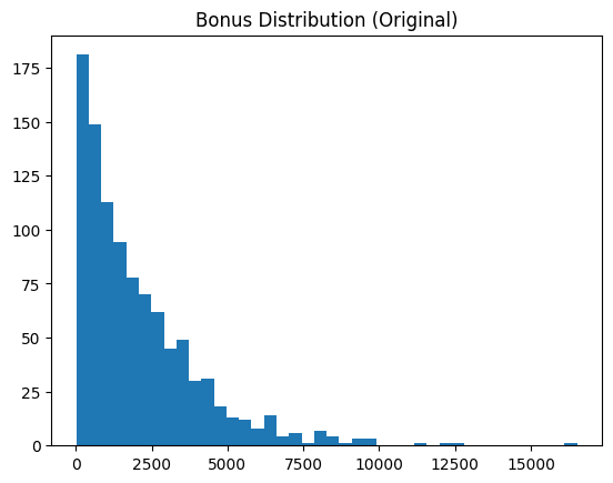
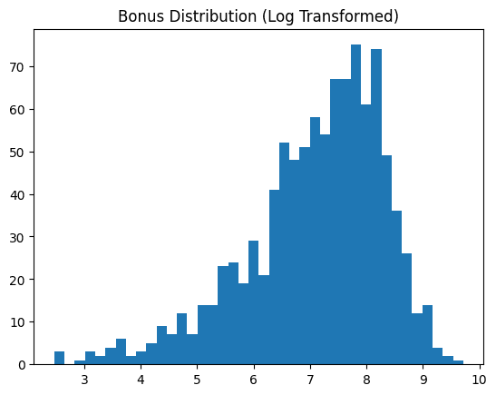
Skewed data attributes, such as "bonus" in the example dataset, often benefit from transformation to resemble a normal distribution. This transformation typically improves the effectiveness of most downstream machine learning analyses. This technique applies a log transformation and displays the data feature before and after the transformation.
skewness = df["bonus"].skew()
print(f"Bonus skewness: {skewness:.2f}")

plt.hist(df["bonus"], bins=40)
plt.title("Bonus Distribution (Original)")
plt.show()

# Log transform
df["bonus_log"] = np.log1p(df["bonus"])

plt.hist(df["bonus_log"], bins=40)
plt.title("Bonus Distribution (Log Transformed)")
plt.show()

7. Detecting Redundant Features via Correlation Matrix
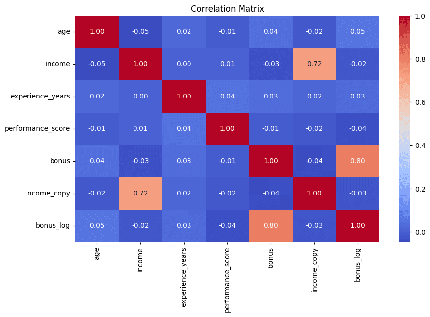
This technique concludes the list with a visual approach. Correlation matrices, displayed as heatmaps, help quickly identify highly correlated feature pairs. Strong correlations often indicate redundant information, which is usually best minimized in subsequent analyses. This example also prints the top five most highly correlated attribute pairs for enhanced interpretability.
corr_matrix = df.corr(numeric_only=True)

plt.figure(figsize=(10, 6))
sns.heatmap(corr_matrix, annot=True, fmt=".2f", cmap="coolwarm")
plt.title("Correlation Matrix")
plt.show()

# Find high correlations
high_corr = (
    corr_matrix
    .abs()
    .unstack()
    .sort_values(ascending=False)
)

high_corr = high_corr[high_corr < 1]
print(high_corr.head(5))
Wrapping Up
These seven useful techniques can enhance exploratory data analysis, helping to effectively and intuitively uncover and address various data quality issues and inconsistencies.
Iván Palomares Carrascosa is a leader, writer, speaker, and adviser in AI, machine learning, deep learning & LLMs. He trains and guides others in harnessing AI in the real world.


